Scrolling pickers in SwiftUI
Today we’ll be exploring the features that ScrollView carrying around since iOS 17 by building a value picker.
Breath some inspiration from this post and let’s get started.
Building The Fence
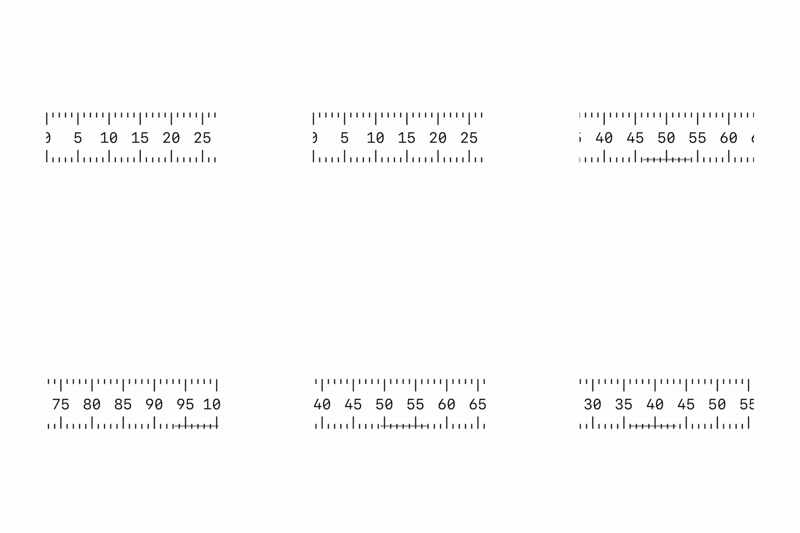
The idea behind the implementation is pretty straightforward. We need to generate a bunch of vertical segments. Some of them are taller and have a text block, some are shorter and have no numbers to display. This is determined by the index of each segment.
First, we define a foundation for the solution.
struct WheelPicker: View {
  // Range of values to be used.
  var values: ClosedRange<Int> = 0...100

  // Horizontal spacing between segments.
  var spacing: Double = 8.0

  var body: some View {
    ZStack {
      ScrollView(.horizontal) {
        HStack(spacing: spacing) {
          ForEach(values, id: \.self) { index in
            VStack(spacing: 40.0) {
              Rectangle()
                .frame(
               width: 2.0,
               height: 20.0
             )
                .frame(
                  maxHeight: 20.0,
                  alignment: .top
                )
              Rectangle()
                .frame(
                  width: 2.0,
                  height: 20.0
                )
                .frame(
                  maxHeight: 20.0,
                  alignment: .bottom
                )
            }
          }
        }
      }
    }
    .frame(width: 280.0, height: 80.0)
  }
}
Thus, we display a dozen vertical segments horizontally. Each vertical segment consists of two rectangles aligned at the top and bottom respectively.

Next, we will improve this solution step-by-step by defining the logic for showing numbers and the behavior for scrolling.
Painting The Fence
Before we continue, let’s look at a standard ruler. The longer segments drawn are those whose sequence number is a multiple of the number of steps between the main values.

That is, for example, between numbers 0 and 10 there are 10 steps, the segments with indices 0 and 10 will be long and the rest will be short.
struct WheelPicker: View {
  // Range of values to be used.
  var values: ClosedRange<Int> = 0...100

  // Horizontal spacing between segments.
  var spacing: Double = 8.0

  // Number of steps between significant indicies.
  var steps: Int = 5

  var body: some View {
    ZStack {
      ScrollView(.horizontal) {
        HStack(spacing: spacing) {
          ForEach(values, id: \.self) { index in
            let isPrimary = index % steps == .zero

            VStack(spacing: 40.0) {
              Rectangle()
                .frame(
                  width: 2.0,
                  height: isPrimary ? 20.0 : 8.0
                )
                .frame(
                  maxHeight: 20.0,
                  alignment: .top
                )
              Rectangle()
                .frame(
                  width: 2.0,
                  height: isPrimary ? 20.0 : 8.0
                )
                .frame(
                  maxHeight: 20.0,
                  alignment: .bottom
                )
            }
            .overlay {
              if isPrimary {
                Text("\(index)")
                  .font(.system(
                    size: 24.0,
                    design: .monospaced
                  ))
                  .fixedSize()
              }
            }
          }
        }
      }
    }
    .frame(width: 280.0, height: 80.0)
  }
}
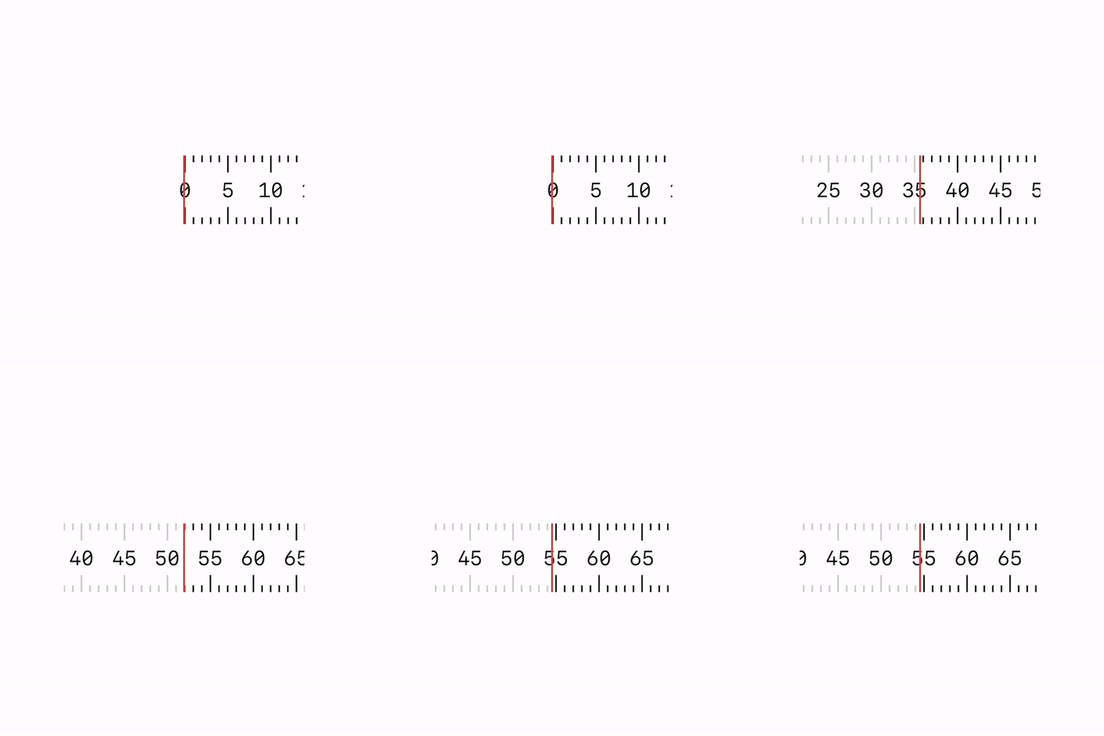
Finishing this part with adding a red line overlay on top of the scroll view so the picker can indicate where the current selection is.
ScrollView(.horizontal) {
  ...
}
.overlay {
  Rectangle()
    .fill(.red)
    .frame(width: 2.0)
}
Scrolling The Fence
We definitely don’t want the default scroll indicator be displayed, so let’s hide it.
ScrollView(.horizontal) {
  ...
}
.overlay {
  ...
}
.scrollIndicators(.hidden)
Next, let’s add some content padding to make the beginning of the wheel be aligned with the red line.
This can be done with the .safeAreaPadding modifier. To calculate a required value for the padding, we use GeometryReader.
GeometryReader { proxy in
  ScrollView(.horizontal) {
    ...
  }
  .overlay {
    ...
  }
  .scrollIndicators(.hidden)
  .safeAreaPadding(.horizontal, proxy.size.width / 2.0)
}
Other option is to pass width as a parameter to view initialiser, but it seems to be not so SwiftUI-ty.

Now let’s add some dynamism to the wheel and apply specific effects to segments and numbers.
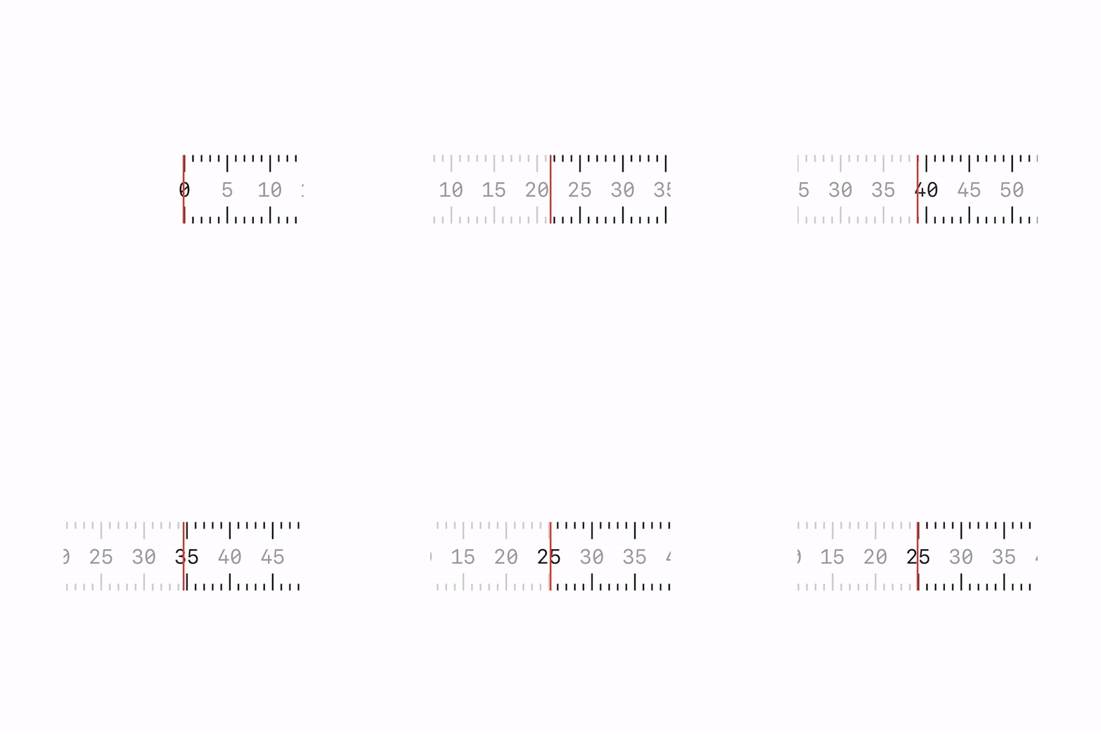
Segments to the left of the red line will be slightly dimmed, while the segments to the right, on the contrary, will appear completely opaque. We achieve this effect by using the `scrollTransition` modifier.
It’s second parameter is a closure which provides two values:
- content — instance of `EmptyVisualEffect` type, which by conforming to `VisualEffect` protocol provides a plenty of options for applying various visual effects, including scaling, blur, blend mode and others
- phase — represents different states of an element placed in scroll view, basically it can tell us whether the element in the center, left or right part of the scroll container
With this knowledge we can implement our opacity effect: for the segments to the left side we will set their opacity to 0.2, for others — to 1.0.
ForEach(values, id: \.self) { index in
  let isPrimary = index % steps == .zero

  VStack(spacing: 40.0) {
    ...
  }
  .scrollTransition(
    axis: .horizontal,
    transition: { content, phase in
      content
        .opacity(phase == .topLeading ? 0.2 : 1.0)
    }
  )
  .overlay {
    ...
  }
}
Make sure to put this transition modifier before number overlay so that the effect is only applied to segments.

The numbers will be darkened everywhere except in the centre. To do this, we use scrollTransition again, but apply it directly to the text view to limit the area of influence.
ForEach(values, id: \.self) { index in
  let isPrimary = index % steps == .zero

  VStack(spacing: 40.0) {
    ...
  }
  .scrollTransition(
    axis: .horizontal,
    transition: { content, phase in
      content
        .opacity(phase == .topLeading ? 0.2 : 1.0)
    }
  )
  .overlay {
    if isPrimary {
      Text("\(index)")
        .font(.system(
          size: 24.0,
          design: .monospaced
        ))
        .fixedSize()
        .scrollTransition(
          axis: .horizontal,
          transition: { content, phase in
            content
              .opacity(phase.isIdentity ? 10.0 : 0.4)
          }
        )
    }
  }
}
Since we are working in a range of integers, it makes sense to stop scrolling only on the segments themselves, not on the space between them. In other words, make the wheel a bit snappy to the segments.
This is where the ScrollTargetBehavior protocol and its namesake modifier come into play. By default it comes with two options:
- paging — makes scrolling look like pagination
- viewAligned — with this behavior scroll tries to align the final position with it’s child views
ScrollTargetBehavior works in conjunction with the scrollTargetLayout modifier. The latter helps to tell SwiftUI which views to consider when calculating the stopping point.
GeometryReader { proxy in
  ScrollView(.horizontal) {
    HStack(spacing: spacing) {
      ...
    }
    .scrollTargetLayout()
  }
  .overlay {
    ...
  }
  .scrollIndicators(.hidden)
  .safeAreaPadding(.horizontal, proxy.size.width / 2.0)
  .scrollTargetBehavior(.viewAligned)
}
Sadly, both options will not help us achieve the desired behavior. Happily, we can define our own by implementing a custom type conforming the ScrollTargetBehavior protocol.
Start by defining a new type called SnapScrollTargetBehaviour.
struct SnapScrollTargetBehavior: ScrollTargetBehavior {
  func updateTarget(
    _ target: inout ScrollTarget,
    context: TargetContext
  ) {}
}
The updateTarget method is the only one required by the protocol. Here, the target parameter is the means by which we can tell scroll view where it should stop. Initially, it contains some size values that can tell where SwiftUI expects a scroll view to stop. We can use these to customise the behavior.
Math corner.
We divide the entire length of the scroll view into some number of small slices. Each slice represents the distance the red line needs to travel to change the value by one. This distance consists of the width of a single segment and the distance between two separate segments.

We need to find for x1 (the expected stopping point, provided by SwiftUI) such that x2 (the desired, evaluated by us) is a multiple of the slice length and nearest to x1.
Wuka-chika-buka-boom, here’s the code.
struct SnapScrollTargetBehavior: ScrollTargetBehavior {
  let step: Double

  func updateTarget(
    _ target: inout ScrollTarget,
    context: TargetContext
  ) {
    let x1 = target.rect.origin.x
    let x2 = closestMultiple(a: x1, b: step)

    target.rect.origin.x = x2
  }

  private func closestMultiple(
    a: Double,
    b: Double
  ) -> Double {
    let lowerMultiple = floor((a / b)) * b
    let upperMultiple = floor(lowerMultiple + b)

    return if abs(a - lowerMultiple) <= abs(a - upperMultiple) {
      lowerMultiple
    } else {
      upperMultiple
    }
  }
}
Now all that remains is to define a convenient method to create the instance.
extension ScrollTargetBehavior where Self == SnapScrollTargetBehavior {
  static func snap(step: Double) -> SnapScrollTargetBehavior { .init(step: step) }
}
And use it in the scrollTargetBehavior modifier. We will consider the step length as the distance between segments and the length of one segment.
GeometryReader { proxy in
  ScrollView(.horizontal) {
    HStack(spacing: spacing) {
      ...
    }
    .scrollTargetLayout()
  }
  .overlay {
    ...
  }
  .scrollIndicators(.hidden)
  .safeAreaPadding(.horizontal, proxy.size.width / 2.0)
  .scrollTargetBehavior(.snap(step: spacing + 2.0))
}
Since we call it a picker, it should be able to pass the value somewhere outside. Let’s define a binding for it.
struct WheelPicker: View {
  @Binding var count: Int

  ...
}
Bind the previously defined property with the scrollPosition modifier. We simply define the binding in place with a custom setter to filter out optional values.
GeometryReader { proxy in
  ScrollView(.horizontal) {
    ...
  }
  .overlay {
 ...
  }
  .scrollIndicators(.hidden)
  .safeAreaPadding(.horizontal, proxy.size.width / 2.0)
  .scrollTargetBehavior(.snap(step: spacing + 2.0))
  .scrollPosition(
    id: .init(
      get: { count },
      set: { value, _ in
        if let value {
          count = value
        }
      }
    )
  )
}
The scrollPosition modifier also works closely with scroll targets and uses their identifiers to pass values. Since we are working with integer ranges, we can expect integer to be returned via the respective binding.
In addition to the visual part, we can add a tactile response. Personally, I really like it when applications implement this detail in their UI components.
5th revision of SwiftUI makes it incredibly easy to add haptic feedback. Instead of UIFeedbackGenerator we can use sensoryFeedback modifier.
ZStack {
  ...
}
.sensoryFeedback(.selection, trigger: count)
Conclusion
Further it is possible to improve this component, for example, by adding the ability to work not only with integers. Or various customisations of segment size, colours, etc.
In general, it’s obvious how much SwiftUI simplifies the handling of fairly non-trivial behaviors by taking away most of the computation.
I leave a gist with the final solution, there are some blanks for its further improvement.
We’ll continue to experiment in future articles. See you soon 🙌
